Motley Moose – Archive

Since 2008 – Progress Through Politics

Archive for August 2008

Some Logo Ideas

OK. So most of you missed the design discussion: basically it revolved around colors (purple was mooted and favored by hey was anyone paying real attention) and then a more substantive discussion was had about feel.

I came up with the following designs because I had a feeling that while the title of our domain is wild and electic, we needed to counteract rather than overemphasise the motley element. I think we need something cool, modern and classy in the logo. Done some design in my time, but I knocked up these logos only to suggest a direction: no cartoons, a real moose, and a classic font
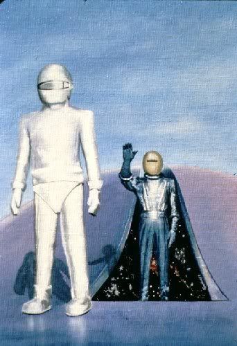
The Day the Earth Stood Still

The fix is in, the die has been cast, the Democratic Vice Presidential Candidate has been chosen.

Many have wondered, many have guessed, many have spoken with authority.  But all were wrong.

Photobucket

First Lounge Diary

  Lorem ipsum dolor sit amet, consectetuer adipiscing elit. Vivamus nibh quam, elementum ac, posuere interdum, suscipit eget, sem. Integer nisi. Praesent consectetuer tortor ut augue. Praesent porta rutrum est. Integer neque. Fusce mattis nunc et enim. Ut nonummy hendrerit massa. Sed suscipit. Sed viverra porttitor enim. Maecenas eleifend. Mauris tempus, sem sit amet adipiscing commodo, quam diam cursus tellus, in sollicitudin lectus mauris quis mi. Donec in velit. In dapibus. Vivamus faucibus turpis sed lorem. Nam elit libero, fringilla vitae, volutpat non, tincidunt et, lectus. Sed accumsan, nisi at tempor viverra, leo nulla ultricies lorem, dignissim sagittis orci est vel erat. In fringilla ante. Phasellus molestie magna vitae libero. Fusce et massa. Suspendisse potenti.

Let’s get cracking!

Alright! Now we can start actually getting content laid out, see how different design things are going to work and look, and generally get rolling.