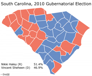
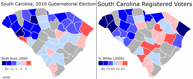
This is the second part of three posts analyzing the 2010 South Carolina gubernatorial election, in which Republican Nikki Haley won a closer-than-expected victory over Democrat Vincent Sheheen. The main focus of these posts will be to explore whether a racial effect accounted for Ms. Haley’s unexpected poor performance.
The previous post can be found here, and the next post can be found here.
(Note: This is also part of a series of posts analyzing the 2010 midterm elections.)
More below.
How to Find a Racial Effect
The purpose of this series of posts is to determine whether or not Ms. Haley’s relatively weak performance was due to a racial effect.
In order to due this, it’s necessary to define what to look for. In this case, it would be normally Republican voters abandoning Ms. Haley due to her race.
Now, South Carolina is a state in which less than 5% of the population is neither white nor black; minorities other than blacks play a negligible role in the state’s politics. It is also a very racially polarized state, like most places in the Deep South. Blacks vote Democratic; whites vote Republican.
There is one final factor to take into account. When Republican Bobby Jindal ran for governor in 2003 and faced racially-based opposition by (white) Republicans, such opposition was not evenly distributed. The Republicans who abandoned Mr. Jindal tended to be predominantly from rural, relatively lower income areas. This is something that is not especially surprising, although it conforms to some unfortunate stereotypes.
For these reasons, an examination of Republicans who abandoned Ms. Haley for racial reasons would look specifically at areas with lower-income whites. These areas would be expected to shift more Democratic than the norm.
Democratic Shifts
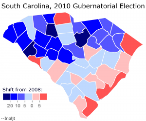
To begin this post, let’s examine the places where Republicans improved upon their 2008 performance, and the places where Democrats improved upon 2008.
Naturally, given that Ms. Haley did worse than Mr. Sheheen, one would expect Democrats to have relatively more improvement.
This turns out to be the case:
Here one sees a very interesting regional pattern, a pattern that I did not expect when making this map.
The northern parts of South Carolina moved strongly Democratic in 2010. The sole exception is York County, which for whatever reason shifted Republican (there is, strangely enough, very little that differentiates this county with others in the region; nor did either Ms. Haley or Mr. Sheheen represent the county as politicians before 2010).
On the other hand, the coastal regions actually supported Ms. Haley more than they did Senator John McCain.
This is a very interesting regional divide; it is something that is entirely hidden by normal partisan patterns.
Whites
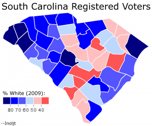
Now, let’s take a look at white registration figures:
This map shows what percent of South Carolina’s registered voters are white. The information is mandated by the Voting Rights Act, given South Carolina’s history of preventing minorities from voting, and can be found at this website. It is also quite useful for the purposes of this analysis. (For fun: compare this map to President Barack Obama’s performance).
In order to make comparisons easier, the same color scale was used in this map as in the previous map. The whiter a county’s voter population, the bluer the county on the map.
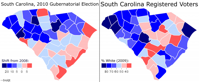
If white Republican voters rejected Ms. Haley due to her race, then the whitest counties here would also have the strongest Democratic shift (i.e. the colors in each map would roughly match).
Let’s compare the maps:
There is a bit of a match, but not much. A lot of very white counties shift strongly against Ms. Haley, but a lot of them also shift strongly for her (especially along the coast).
One can reasonably conclude that a lot of white voters – i.e. Republicans – remained loyal to Ms. Haley despite her Indian heritage.
This is not entirely unexpected. Mr. Jindal also retained a large amount of white support, mainly amongst suburban and wealthy whites.
Adjusting For Income
Where Mr. Jindal did especially poorly – and why he lost the 2003 gubernatorial election – was amongst rural, lower income whites in Louisiana.
Let’s therefore shift this analysis by adjusting for income; in other words, by focusing upon lower-income counties in South Carolina.
South Carolina’s median household income was $42,580 as of 2009, according to Census Data (which can be accessed here).
One can therefore adjust for income by restricting the analysis only to those counties in which median household income was below the state median.
This is what happens:
This looks like a far stronger relationship. In the poorer parts of South Carolina, it appears that the whiter the county, the more against Ms. Haley it shifted.
It seems that we have found something here.
So far this analysis has been relatively light on the statistical side of things; it kind of looks like there is a pattern in the map above, but perhaps there isn’t one. How likely is it that this could have occurred by chance?
The next post will answer this question.
–Inoljt
