The United States economy is a subject that is very much on the mind of Americans today. It’s also a very obviously influential part of the world; the American consumer market, for instance, often sets trends around the world.
Let’s take a look at the history of the United States economy. How did the American economy become as big and influential as it is today? We begin two hundred years ago, in 1800. Note that the next post will look at three specific moments during the American economy.
More below.
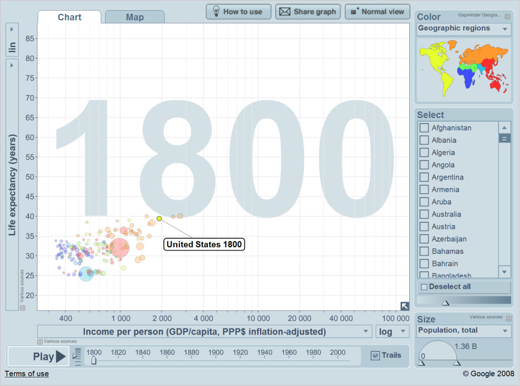
This picture comes from the website gapminder, maintained by a Swedish professor. I have previously used this website to compare North Korea’s development with South Korea’s, here. That post has a good summary of what this graph is saying:
Gapminder shows graphics of different levels of every imaginable type of statistic amongst the world’s varying countries.
This is the most basic graph: it shows wealth and health…The y-axis is life expectancy. The left axis is income per person (in dollars adjusted for inflation and purchasing power parity) put on a logarithmic scale (so that the difference between $1,000 and $2,000 is just as important as the difference between $10,000 and $20,000; this makes comparing things much easier). As one would expect, wealthier countries generally have higher life expectancies.
So this is the world in 1800, more than two centuries ago. Let’s take a look at what happens next:
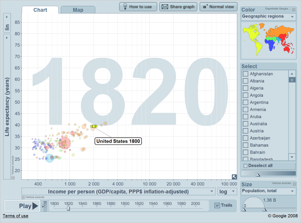
The United States does pretty badly this generation; it basically ends up making no progress economically nor in terms of health.
1820
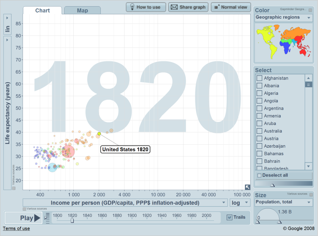
Nevertheless, even as early as 1800 and 1820 the United States is one of the world’s wealthiest and healthiest places. A lot of economic analysis has been done on how America became so wealthy. Well, the answer is that the United States always has been this way, as this graph indicates. Even during the colonial era the English colonists enjoyed arguably the highest living standard in the world.
Let’s look at what happens in the next twenty years:
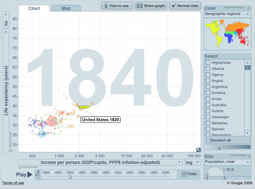
This is the era of Andrew Jackson, and the United States makes progress during these years. The economy grows, although life expectancy does not.
1840
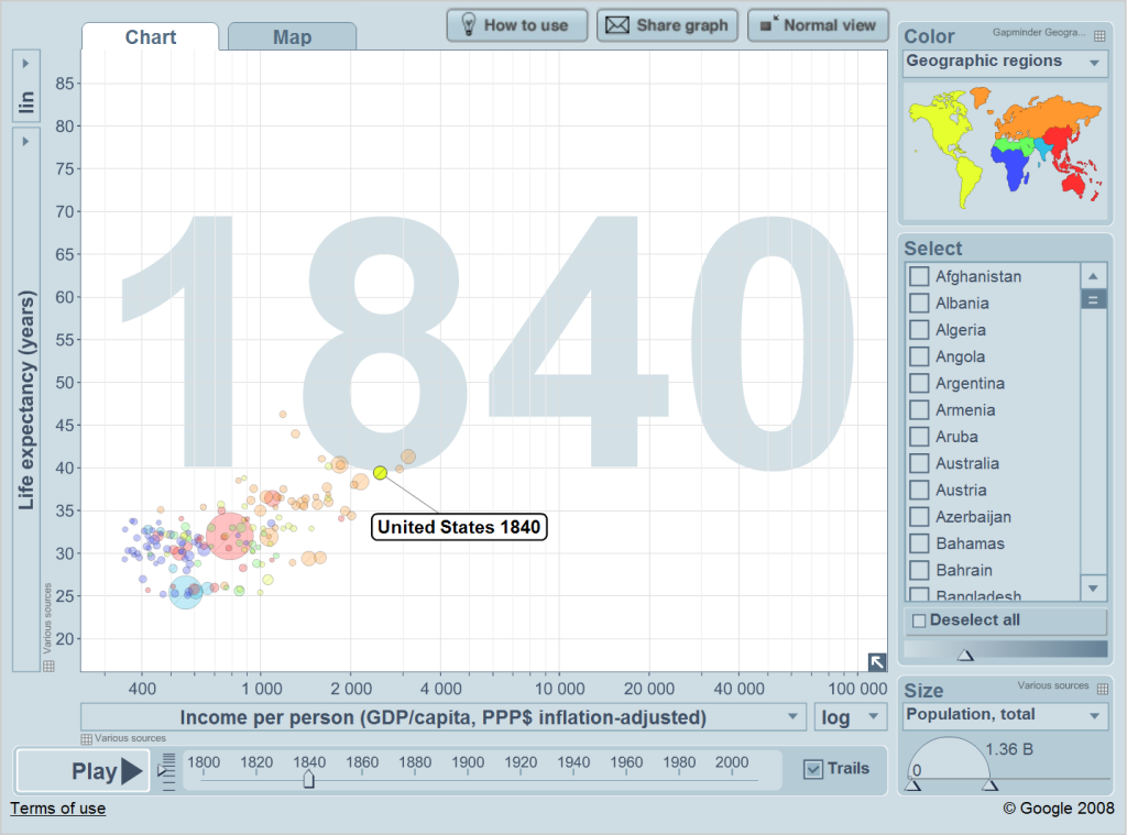
Again, the United States is on top of the world in 1840. There are, however, two European countries (or orange circles) that have been consistently ahead of America since 1800. What countries are these? Well, the bigger circle at the very right is the United Kingdom. It’s unsurprising that the United Kingdom is the world’s wealthiest country during this period, considering that it’s at the forefront of the Industrial Revolution. The smaller circle is the Netherlands.
What happens next?
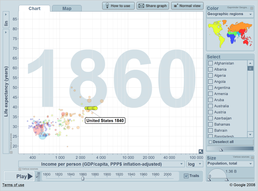
Well, America’s economy grows at the fastest rate yet. The antebellum era apparently is quite good for the United States economy. Life expectancy, however, remains flat.
1860
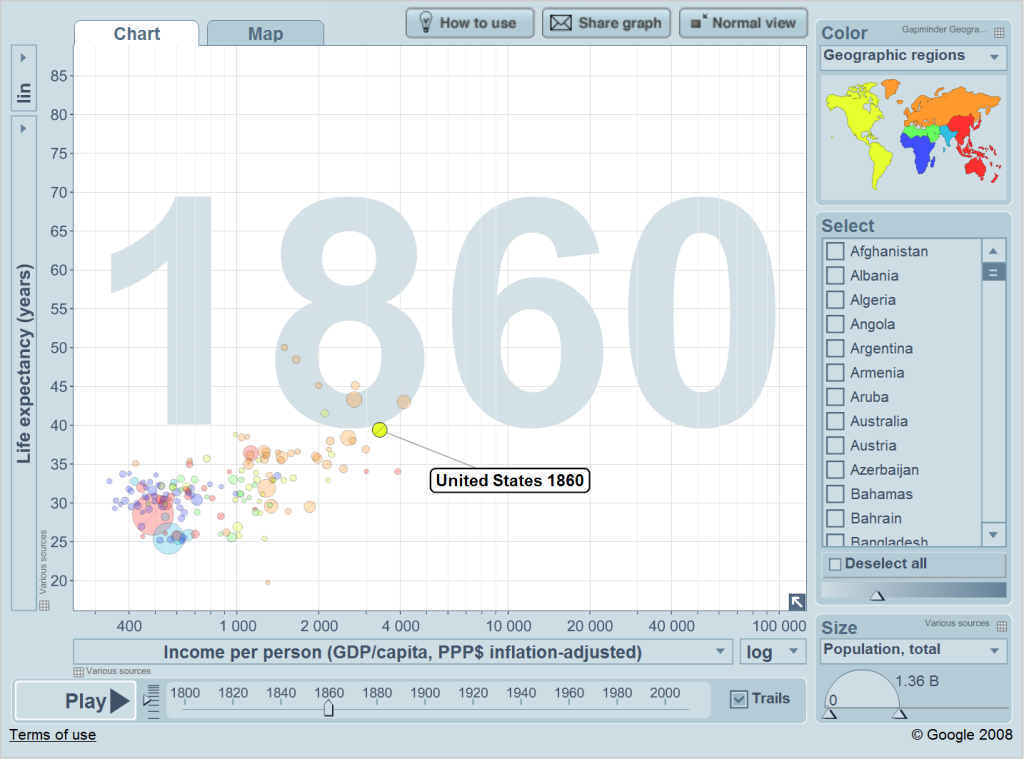
While economic growth has been steady during these sixty years, life expectancy has stayed flat. Here the weaknesses of gapminder come into play. One should realize that gapminder is not the literal truth; it’s a graphic that does its best to resemble reality.
This graphic is as reliable as the data it’s based off of. In my analysis on North Korea and South Korea, there was a huge problem for North Korean data – it didn’t exist or was false. So basically the entire North Korean graphic was a model using artificial numbers created by the authors of gapminder.
The economic data for the United States derives from a study titled Macroeconomic Crises since 1870. The authors of that study have created a dataset for their study. This is what gapminder uses. In general, it’s quite reliable; United States economic statistics are the best and most comprehensive in the world, even today.
On the other hand, let’s take a look at life expectancy during the Civil War and Reconstruction era:

The destruction of the Civil War doesn’t stop the United States economy from growing yet again. On the other hand, common sense indicates that life expectancy fell during the Civil War. After all, more Americans died in the Civil War than in any other war in American history – and America’s population in 1860 was a lot smaller than the population today. What gives?
Well, the life expectancy data comes from several sources. From 1989 to the present, gapminder uses US Census Bureau data. From 1933 to 1988 the Human Mortality Database is used. From 1901 to 1932 the Human-Life Table Database is used. From 1880 to 1900 Professor James Riley’s compilation of life expectancy estimates (from over 700 sources) is used.
And what about from 1800 to 1879? Well, here the authors use a simple model. A very very simple model. They assume that all countries go through a health transition, and that the United States had not undergone this transition from 1800 to 1879. So gapminder sets United States life expectancy as 39.41 years for this entire 80-year period.
1880

By 1880, the United States has caught up with the United Kingdom. Out of all the countries in the world, only Australia is wealthier. On the other hand, Americans are generally in worse health than the wealthiest European countries.
Here’s the United States as a new century dawns:
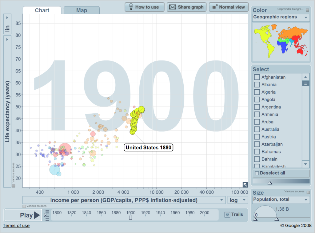
With a new dataset in use and the advent of new medical technologies, American life expectancy jumps enormously. On the other hand, the economy doesn’t do that great. It’s commonly said that during this era the United States undergoes industrialization and becomes a world power.
1900
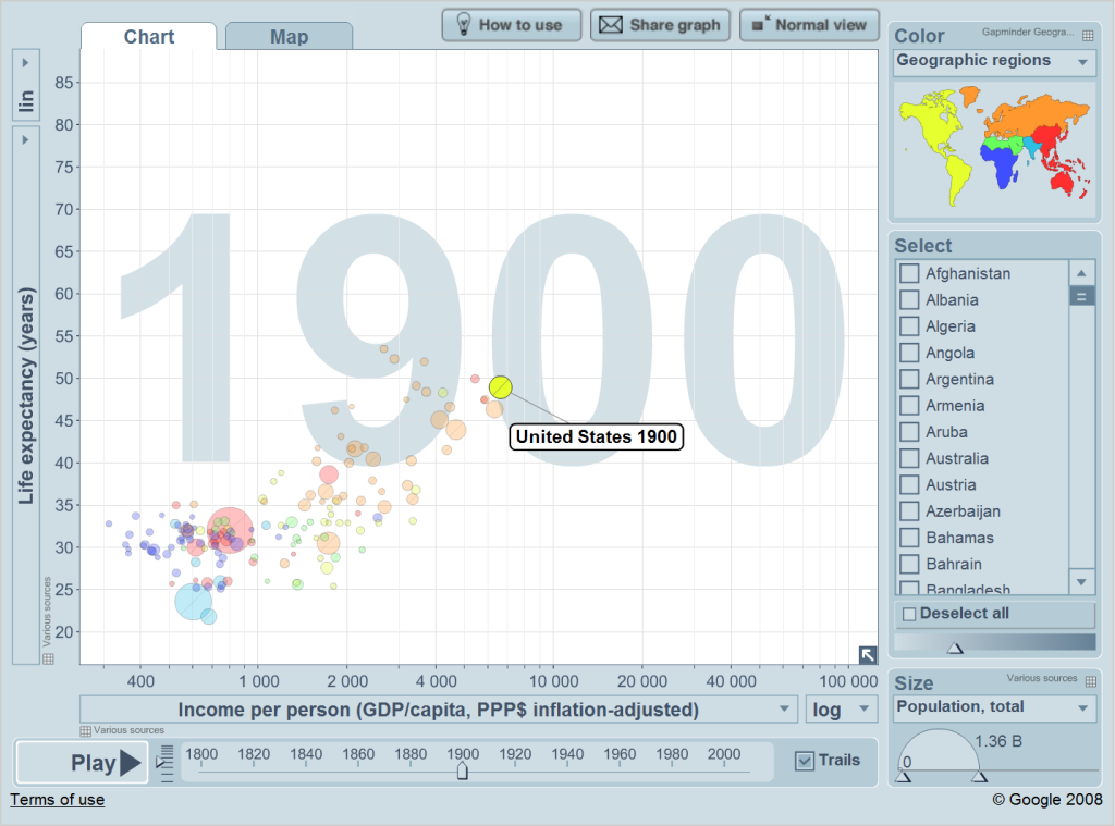
One reason for American power is due to the population increase, fueled by immigration. The United States population is on par with most big European states during this period. It seems that a lot of the expansion of American power in this time is based on population growth; progress in living standards isn’t exceptional. Despite this, the United States has become the world’s richest country.
This continues during the Gilded Age and World War I:
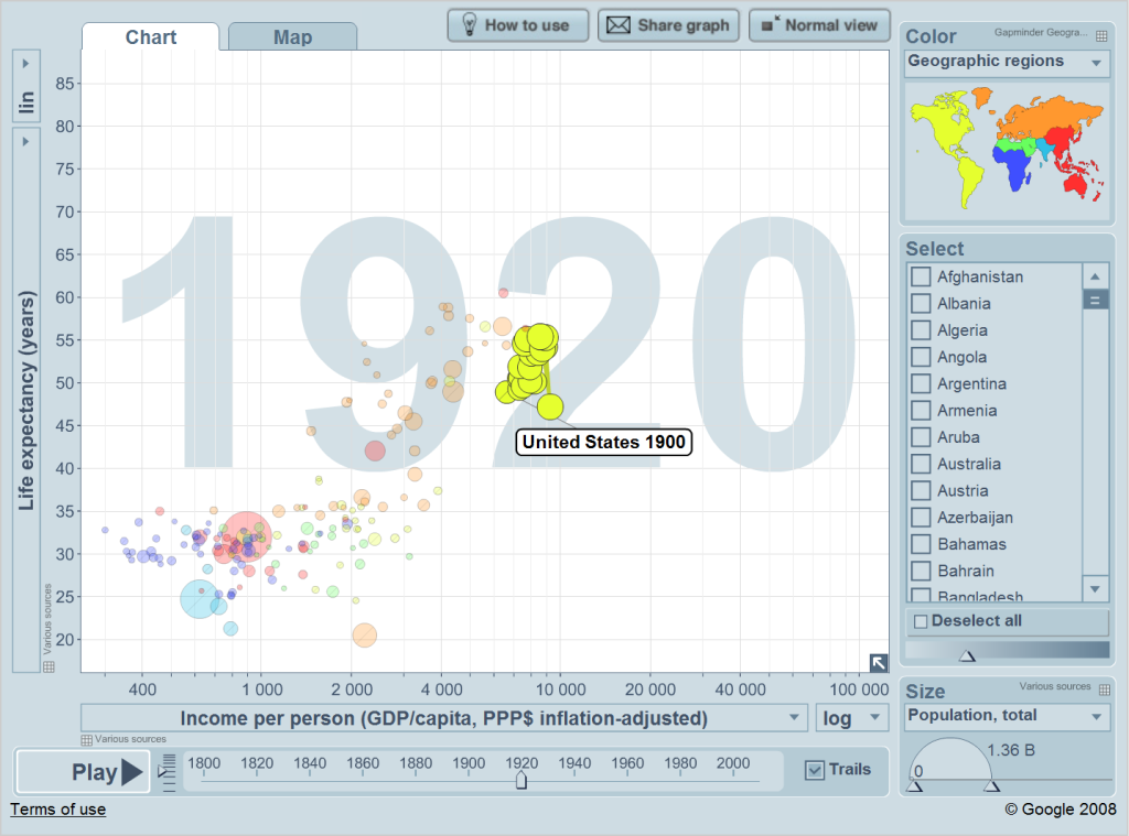
The Gilded Age is commonly thought of as the time when the United States really became a great power. The population and life expectancy increase is impressive (note that the outlier in terms of low life expectancy is the year 1918). Yet there’s an awful amount of economic backsliding and economic crisis during this period.
1920
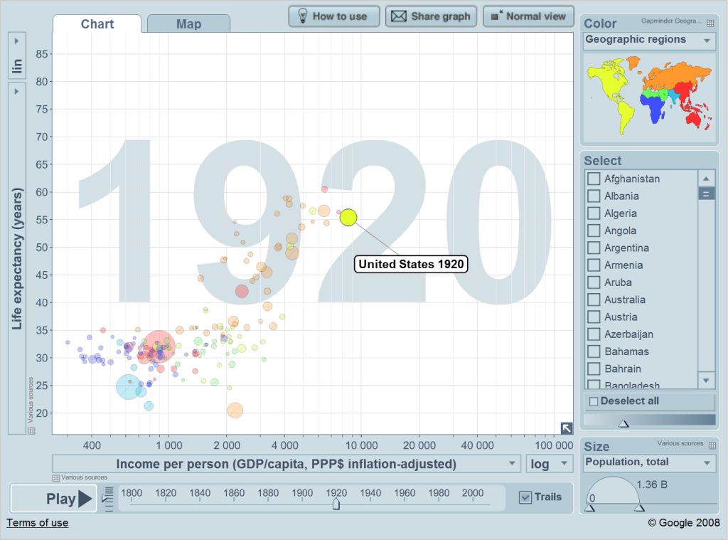
In relative economic terms, however, the rest of the world has been doing even worse. This is mostly the result of World War I. American living standards are squarely ahead of everybody else in 1920, although once again American life expectancy is somewhat subpar.
Then comes the Great Depression. Did that knock the United States off its track?
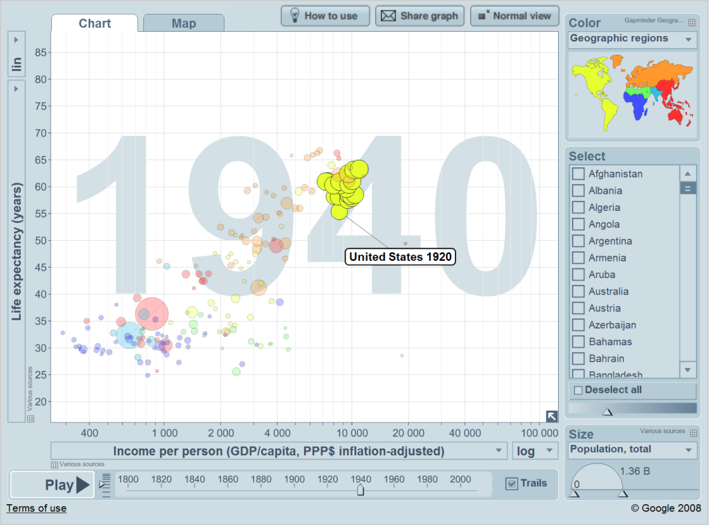
Kind of. Life expectancy continues to improve, but again the improvement in living standards isn’t great. Indeed, this whole era from 1880 to 1940 features regular economic crisis and chaotic patterns in economic growth.
1940
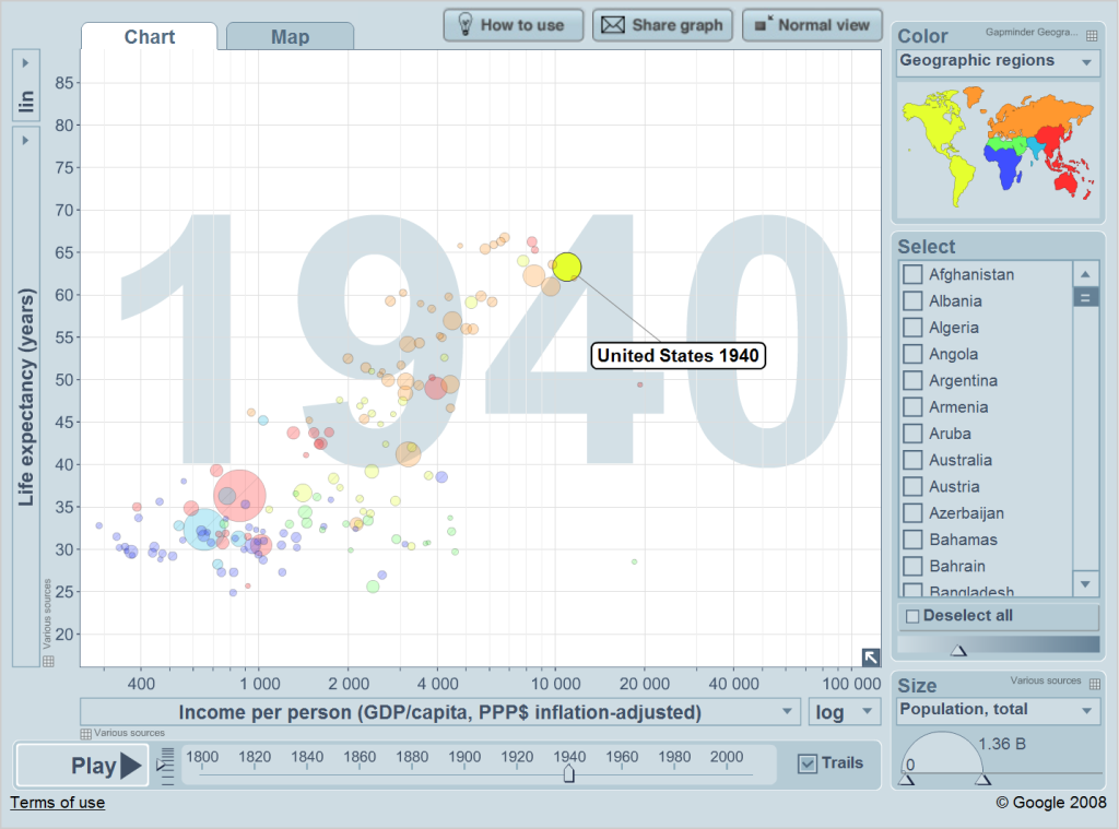
Nevertheless, the United States is still very wealthy and fairly healthy in 1940.
Let’s take a look at World War II:
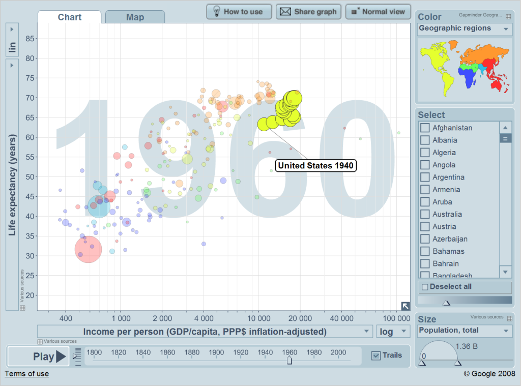
Here a new pattern sets in. Unlike the previous 80 years, the United States economy starts growing at a steady rather than chaotic rate. Life expectancy also increases, but by a lesser extent. There’s a huge economic boom during the war years and – surprisingly – no drop in life expectancy during the war.
1960
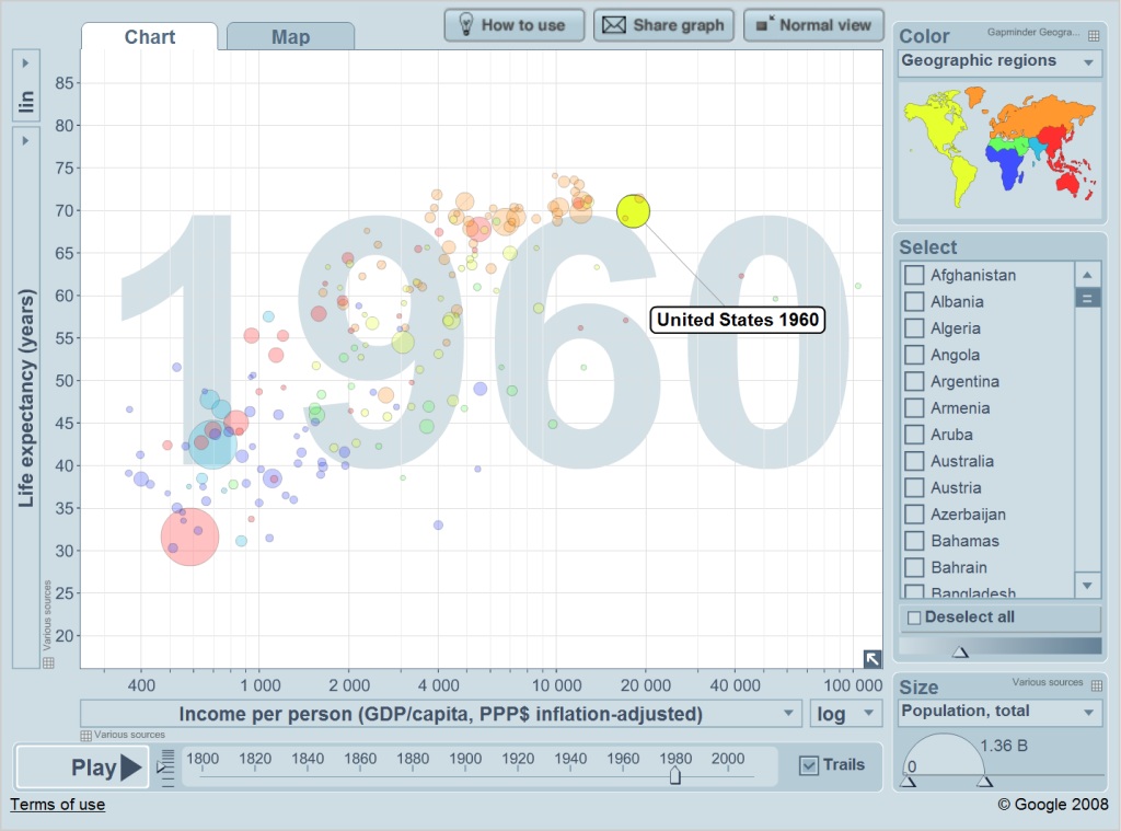
The ’50s and ’60s are commonly and nostalgically seen as the time when the United States was on top of the world, and this picture provides good evidence. Economically the United States is ahead of everybody else to the greatest extent in its history. On the other hand, the Soviet Union does have a bunch of nuclear weapons pointing at the United States. People tend to forget that fact.
So what happens during the Vietnam War and oil crisis?
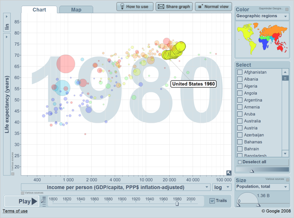
Well, the economy does pretty well, although it slows down during the latter period. Life expectancy is the opposite; it slows down during the first part and then increases during the second part of these two decades.
1980
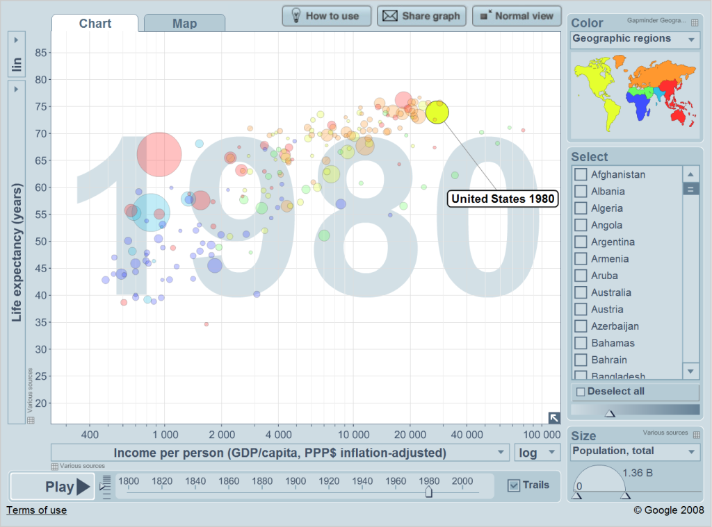
After a great economic boom, the rest of the West and Japan have almost caught up to the United States. In a sense, things are back to normal. In another sense, America’s allies are closer to its economic living standards than at any other time in history.
Then come the Reagan and Clinton years:
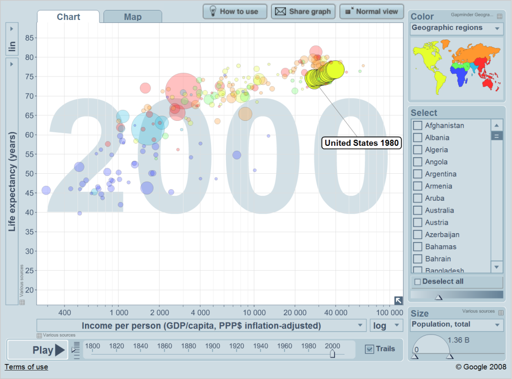
The pattern here is quite similar to that from 1960 to 1980. Both living standards and life expectancy increase slowly but steadily.
2000
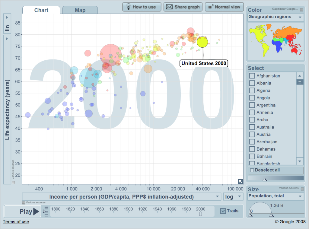
Again, the rest of the First World is nipping at America’s heels. Yet only four tiny countries are actually richer than the United States. As is historically the case, life expectancy in these countries is higher than in the United States.
And finally, the past decade:
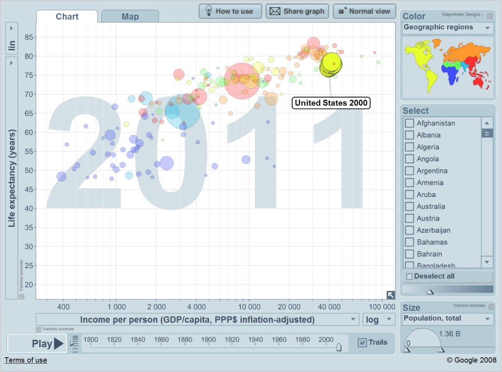
It’s a pretty terrible decade; the United States basically goes nowhere.
Today

Strangely enough, however, the picture looks pretty similar to that in 1980. Despite a decade of terrible American economic growth, the rest of the First World hasn’t surpassed the United States. Right now a total of eight “countries” are wealthier than the United States: Brunei, Hong Kong (China), Kuwait, Luxembourg, Macao (China), Norway, Qatar, Singapore. As throughout history, American health is relatively worse.
Conclusions
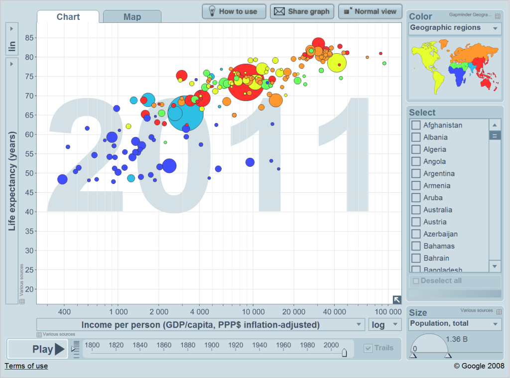
There are several patterns throughout this analysis. Relatively speaking, the United States has always been at the top. It’s always been wealthier than almost all other nations. On the other hand, the United States has also always had relatively low life expectancy for its living standards.
The United States has also always grown at a slow but steady rate. There are periods of slower growth (such as in the early twentieth century) and periods of faster growth (such as in the middle of the twentieth century). But the growth is always there.
Finally, ever since World War II there has been a cluster of First World countries just behind the United States. This cluster of countries, however, has never actually caught up. I am quite curious to see if that day will ever come. Will countries like France, Germany, Japan, and the United Kingdom ever actually surpass the United States?
–inoljt
